Tuesday, November 29, 2011

Direct URL Links to Bloomberg Graphs

Calculated Risk has a post about monitoring the TED spread and 2-year US dollar swap spread as the Europe crisis continues to develop. Having decided to have these two charts automatically be emailed to me weekly, I need to find the data, download it, graph the data series myself, and email the graphs to me.  Or, if I can live with the Bloomberg style graph – use the following two links, download the graphs, and email them to me:

2-year swap spread: http://www.bloomberg.com/apps/chart?h=400&w=520&range=1y&type=gp_line&cfg=BQuoteComp_10.xml&ticks=USSP2:IND&img=png

TED spread: http://www.bloomberg.com/apps/chart?h=400&w=520&range=1y&type=gp_line&cfg=BQuoteComp_10.xml&ticks=.TEDSP:IND&img=png

I tried to play with the parameters – height (h) and width (w) works. I can change the ticker by modifying the string after “ticks=”. For example, if I want a plot of the SP500, I use the following:

http://www.bloomberg.com/apps/chart?h=400&w=520&range=1y&type=gp_line&cfg=BQuoteComp_10.xml&ticks=SPX:IND&img=png

I can also adjust the time range of the graph to some time less than a year (6m, 3m, etc.). However, I cannot adjust the time range of the graph for longer than a year. Well, off to do the rest of the automation.

Reference: NY Times: "Crisis in Europe Tightens Credit Across the Globe" [Calculated Risk]

Thursday, November 17, 2011

Stata Code Snippets: Summarize Statistics by Category

I calculate summary statistics by categories in SAS a lot - like finding the annual average of a variable by security type. Here are some code snippets for doing that in Stata.

The command to use is collapse. For example, the following code calculates the average mpg and average weight between foreign and domestic cars from the AUTO dataset.

    sysuse auto
    collapse(mean) mpg (mean)weight, by(foreign)

Unlike SAS, which allows you to output the summary data to a different dataset, Stata alters the dataset.

To make a prettier table with summary data, use the tabdisp command:

tabdisp foreign, cell(mpg weight) format(%9.2f)

If you run the code, you will find that, as expected, foreign automobiles are lighter and have higher mpg in the late 70s according to the data.

Monday, November 14, 2011

Jump to a Certain Location on a Lengthy Page Instantly with Shift and Click

On a webpage with a lot of text, I often find myself clicking the scroll bar and holding on the left mouse button as the web browser slowly scroll its way up (or down) - a page at a time. If the page is long, it can take a while. The solution? Hold shift and then click at the approximate location on the scroll bar that you want to jump to. This will bring you immediate to the location.

I never thought there is a more efficient way to handling this situation, and therefore never thought of googling for a solution. I come across this by accident – after almost two decades of using computers.

Saturday, November 5, 2011

John William’s Estimated QE2 Effects from the Literature

I have been meaning to make a visual aid to some numbers John Williams referenced in his September 23, 2001 speech. It subsequently was written up in the FRBSF Economic Letter (Table 1).

The figure below is his calculation of what various papers in the QE literature would estimate the QE2 effects to be (a large-scale asset purchase of $600 billion). The strength (or perhaps weakness) of these studies is that they are done using different methods and different data. That they are mostly all positive is encouraging. This is the rationale for policy maker’s belief that QE has been effective.

From the economic letter:

… summarizes a number of these studies. In order to facilitate comparison, the estimated effects in each analysis have been renormalized to correspond to the estimated effect on longer-term bond yields of a $600 billion LSAP operation. That, of course, was the size of the Federal Reserve’s asset purchase program completed earlier this year.

Almost all of these estimates involve author’s calculations to renormalize the effect to a $600 billion U.S. LSAP.

Now, I have no idea what “longer-term bond yields” is exactly, nor is it clear to me how the normalization is done. The figure below also omitted the Bernanke-Reinhart-Sack (2004) estimate from the Japanese event study – since it has implied effect of 400 basis points with 370 basis points error bands.

image

The footnote in the table lists the source of the data:

Papers from the figure: Modigliani-Sutch (1966, Sections 3-4), Bernanke-Reinhart-Sack (2004, Table 7, Figure 6, and author’s calculations), Greenwood-Vayanos (2008, Table 2), Krishnamurthy-Vissing-Jorgensen (2011, Section 4), Gagnon et al. (2011, Tables 1-2), D’Amico-King (2010, Figure 3), Hamilton-Wu (2011, Figure 11), Hancock-Passmore (2011, Table 5), Swanson (2011, Table 3), Chung et al. (Figure 10), Joyce et al. (2011, Figure 9), Neely (2011, Table 2). 


Reference: “Unconventional Monetary Policy:Lessons from the Past Three Years," FRBSF Economic Letter 2011-31 [Federal Reserve Bank of San Francisco]

Treasury Yields and Comments on Event Study

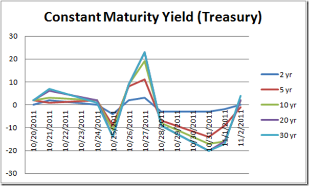
The graph below plots daily change in constant maturity yield (for five maturities from the 2-year yield to the 30-year yield) from October 20 to November 2. Given all the events in Europe these past weeks, the change swings from very negative to very positive to very negative again.

image

Now, if I were to study the actions of the European Government on US Treasury yields using an event study scheme, how would I analyze the events of the past month? Where would the events be, and how many days should my event windows covers?

These are important considerations when conducting an event study analysis, and underline the method’s potential issues. Outcome can be sensitive to event window size and event selection. Yet, this is a popular scheme in measuring monetary policy effects – from quantitative easing to FOMC announcement effects.

I am starting to think about a paper that I have been putting aside, tentatively titled “Policy Duration Effects under the Zero Interest Rate Environment.” The current version uses the standard event study scheme, and I find myself facing the issues I have described above. I think I have come up with a new way to analyze the data differently, and hope to have a new version of the paper soon.

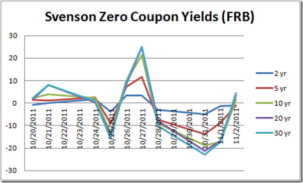
As a side note, I also looked at the Federal Reserve’s Svensson Zero coupon yield (graph below). The Svensson yields are constructed using a different smoothing method than the constant maturity yields from the Treasury Department. The Svensson yields more importantly omit the on-the-run Treasury securities in its estimation, whereas the constant maturity yields use only the on-the-run securities. However, in the past month, the fluctuations between the two sets of yields are similar.

image

Reference: Daily Treasury Yield Curve Rates [US Department of the Treasury],
  FRB: Research Data [Board of Governors of the Federal Reserve System]